8 Rules for Decorating Your Home with Bright Colors
Does your home need more color? Bright colors can add swagger to a living space. And there are a lot of people who are over-cautious when deciding the color scheme of their homes. After all, there's less risk in sticking with the tried-and-true, but where's the excitement and fun in that? Bright colors can add life to any home, but it’s a good idea to keep certain things in mind when working with bright colors. So, before you run off to the paint store, check out these tips.
1. The 60-30-10 Rule
The 60-30-10 rule is sort of a hymn among interior designers and it works like this:
- Use one color for 60% of the room (the walls possibly?)
- Another color for 30% of the room (maybe the window treatments and furniture?)
- And the third color for 10% of the room (a few accents)
2. Stick To a Color Scheme
Naturally, you don’t want to just pick any three random colors for the 60-30-10 rule. Some colors can’t be fixed by rule #1.
- When you choose your color scheme, keep in mind that complementary color schemes tend to make a room look more crisp and eye-catching. Complementary colors are colors that have the highest contrast when placed next to each other. Also called opposite colors, they can be found across from each other on a color wheel. For example, red and green or blue and orange.
- However, analogous color schemes make it more relaxing. Analogous colors are groups of three colors that are next to each other on the color wheel. An example would be red, orange, and red-orange. This type of scheme creates a rich, monochromatic look.
3. Black Balance
Professional video cameras have a setting called “black balance.” It corrects the camera to recognize true black. As a result of this, the other colors look more lifelike and have better contrast. In the same way, adding an element of black can bring out the best in any brighter colors you use.
4. Suit the Color to the Purpose
Colors have psychological effects. For example, some shades of orange and yellow might make you hungry, but blues can calm your nerves. This is also true for most shades of green. So, before choosing a color scheme for a room, examine how those colors affect you.
5. Get Inspiration from Nature
Mother Nature is a master at combining colors. Why not get your inspiration from nature?
You could use the colors of a day at the beach or the forest in autumn. If you have a view of nature outside your window, you might want to bring the natural colors inside.
6. Work With What You Have
Unless you are planning a major re-do, the last thing you want to do is replace everything in your living room because nothing goes with your wall color. Try to work with your existing items and include new ones to produce a cohesive color scheme with some bright new colors.
7. It's All About the Contrast
If you want to make a room look more modern and crisp, go with a high contrast color scheme. But if you want to highlight the softer qualities in your space, turn down the contrast somewhat. It doesn’t mean you can’t bring in bright colors. It just means that you will want to think about how they interact with the overall feeling of the room.
8. Try Before You Buy
Before you go all the way with your room, get paint swatches from the paint department. Get fabric swatches from the furniture, or bring in a pillow or cushion from the furniture you're keeping to match with new pieces. If you are replacing your carpet, bring a piece to match it up to new items. You may find a piece of art or new throw pillows to tie it all together. There are many ways to introduce new colors into your home.
Break the Rules
As they say, rules are meant to be broken. If your fashion sense tends to be more skeptical of rules, then write your own rules. It’s your home. In the end, your opinion is the one that matters most.
Ways to Add Color to Any Space
Sometimes you just want to add a little something to your mainly white, beige, or gray space. Don’t be afraid of going too bold because no matter what your comfort level, there is a way to mix pops of color into any space. Here are some ways:
Bright Color Accessories
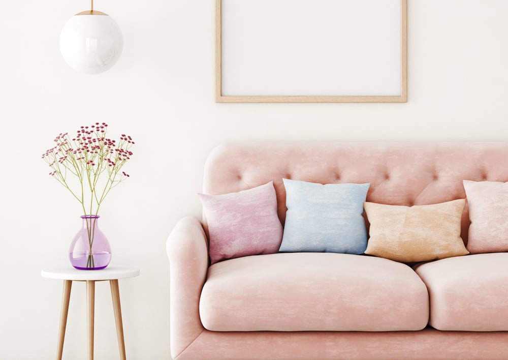
- Buy a colorful rug—A rug with a colorful component will help you ease into a more colorful décor.
- Use bright accessories—A grouping of like-colored accessories can add impressive pops of color to your space.
- Mix in flowers and plants—A colorful floral arrangement or house plant will add a lively element to your home. And they are portable so you can try out different locations to find a spot that needs a shot of color and life.
- Get artistic—If you like to keep your furniture and accessories monochromatic, you can bring in pops of color through artwork and photography. Try out some bold prints or mixed media collages.
- Use a pattern for inspiration—A patterned rug or throw pillow often provides a foolproof color scheme. This will take all the guesswork out of pairing colors.
- Go with a saturated textile—This is designer-speak for adding a single patterned or colored piece to a neutral space. Opt for a single, attention-getting throw or blanket to brighten up a room without having to completely redecorate the whole room.
Colorful Statement Furniture
- Choose a statement piece—Bring in pops of color and make a statement with a single saturated piece of furniture. A bright-colored chair is a simple way to add color to a room with one purchase.
- Start with soft shades—If you are ready to move from a neutral color scheme but not ready for a bold array of colors, start with soft colors in small doses. Colors like peach, blush, mint, and pale yellow will give a change of perspective to your space without looking too out of place with your neutrals.
- Include a single accent color—Use a single accent color to make a neutral space look more interesting.
- Limit your colorful pieces to two distinct accents—If you are going to bring color into your space through accents and accessories, limit yourself to two different colors. This will keep you from getting carried away and prevent your room from becoming disconnected and unpleasant.
- Use bold window treatments—A step above a bold throw pillow is colorful curtains or drapes.
using Bright Colors in a Small Space
Okay, so how do you use bright colors in a small space? Emily Henderson of “Style by Emily Henderson,” says the “Small spaces allow you to commit to something that would normally scare you in a larger room. So have fun and allow yourself to make that room special.”
Painting
First of all, if you are going to paint the room, play around with paint samples. Go with a color that makes you feel good. Then, keep in mind when choosing a bright color for a small room, the paint chip will always look more subtle than when it’s painted on all four walls. A good way to test it out is to paint a poster board or piece of paper before committing to it.
Avoid Trends
Unless you love it, try to resist trends and pick a color and a style of furniture that goes with the style of your home. Because bright colors are noticeable, you might get tired of them quickly. Go with something that suits your preferences and the feel you want the room to give off.
Jewel Boxes
Small spaces can be treated like jewel boxes. Using dull colors can leave them drab and unused. Instead, highlight the space with pops of color. By doing this, you draw people’s attention to the style of the room as opposed to its size.
Experiment with Décor and Artwork
If you don't want to commit to painting, use colorful furniture, artwork, plants, and flowers to bring in the excitement. Throw pillows or a patterned colorful blanket are good ways to add color and easy to change out if you get tired of it.
Use Orange, Yellow, and Red in Small Touches
Although it's up to you what colors you use, some are better in small spaces. Orange, yellow, and red are the colors of fast-food restaurants because they cause hunger. They can be overpowering, so use them with caution. If you must have them, try the pastel version. Anything that feels too electric or vibrant will make the room feel small and cheap.
Balance it Out
Make sure if you use a bold or bright color, use a complimentary muted color (tone on tone) and then fill the rest of the space with neutrals. Using too many different colors won't work.
Let’s Get Colorful
Now that you are armed with tips and hints and the “rules,” it’s time to get out and get creative! Right? But where can you go to find the latest and traditional styles plus expert advice to get you started? At Badcock of South Florida, we are here to help you bring your ideas to life. And we have 11 locations in South Florida so we're close to you wherever you live. Or you can shop online at www.badcocksfl.com. Have questions? Contact us now.


